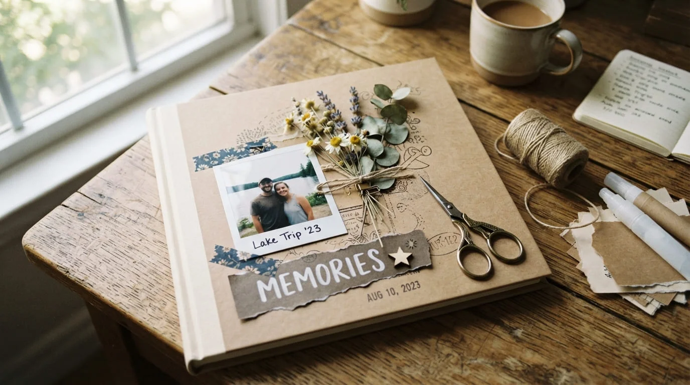
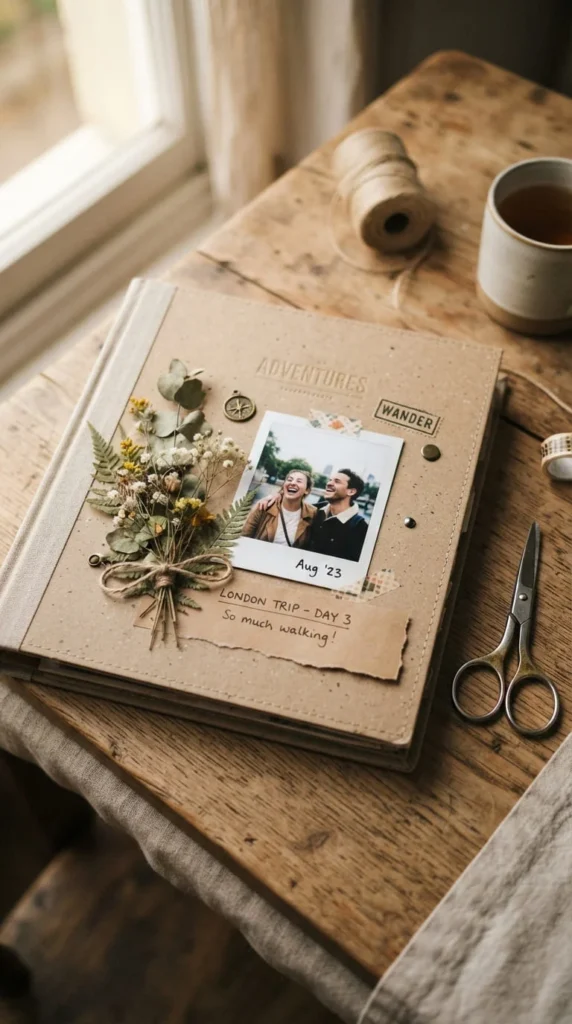
A scrapbook cover sets the tone for everything inside it, and getting that first page right is often the difference between an album that feels thrown together and one that actually looks intentional. Aesthetic scrapbook cover ideas aren’t about piling on stickers and glitter until every inch is covered — the covers that photograph well and hold up over time usually come from a handful of deliberate choices: one focal point, a calm color palette, and materials that fit the memory being preserved. Whether you’re working on a travel journal, a baby book, a wedding album, or just a personal memory book you want to look back on, the ideas below walk through specific styles, materials, and layout decisions you can actually apply — not just admire on a mood board.
1. Start With One Photo And Let White Space Do The Work
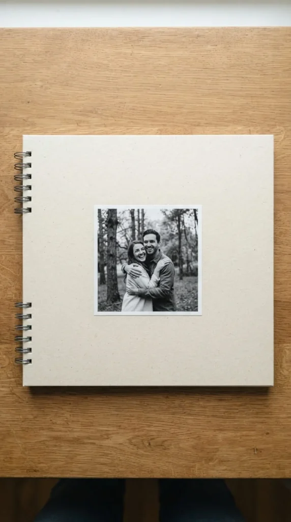
The easiest way to make a cover look designed rather than decorated is to commit to a single focal photograph and resist the urge to add anything competing for attention around it.
Pick the photo that best represents the album’s theme — a candid shot usually works better than a posed one, since it carries more emotion at a glance. Center it, or place it slightly off-center using a rule-of-thirds approach, then leave the rest of the cover mostly empty. A small title beneath or beside the photo is enough; you don’t need a border, a frame, or extra embellishments competing with the image.
This approach works especially well if you’re new to scrapbooking and unsure about color coordination, since fewer decisions mean fewer chances for the cover to feel busy. It also holds up better over time — a cluttered cover from a trendy season can look dated quickly, while a clean, photo-led cover tends to age well regardless of what’s popular that year.
If the photo itself has a lot of visual noise in the background, crop it tighter before printing so the empty space around it actually reads as intentional rather than accidental.
2. Build A Vintage Kraft-And-Lace Cover
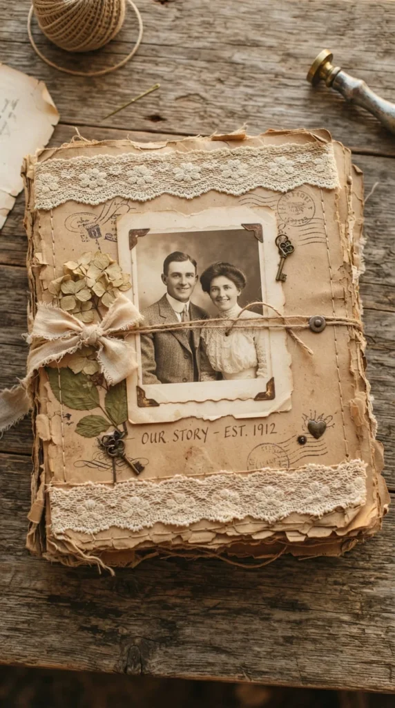
Kraft paper and lace together create an instantly recognizable vintage look, and both materials are inexpensive enough to experiment with before committing to a final layout.
Start with a base layer of kraft paper — its natural brown tone already does most of the vintage work without any extra staining or aging technique. Add a strip of lace along one edge, either straight across the bottom or angled diagonally across a corner, securing it with a thin line of fabric glue rather than a full glue-stick coat, which can show through delicate lace.
A sepia-toned or black-and-white photo fits this style far better than a bright modern one, so consider converting a color photo before printing if the original doesn’t match the mood. Distressing the paper edges slightly — a light tear or a gentle sanding along the border — reinforces the aged feel without looking artificially worn.
This style suits anniversary albums, family history books, and heirloom-style memory projects particularly well. Because kraft paper and lace are both fairly forgiving materials, this is also a good starting project if you’re still building confidence with layout and adhesive work.
3. Press Real Flowers Into A Botanical Cover
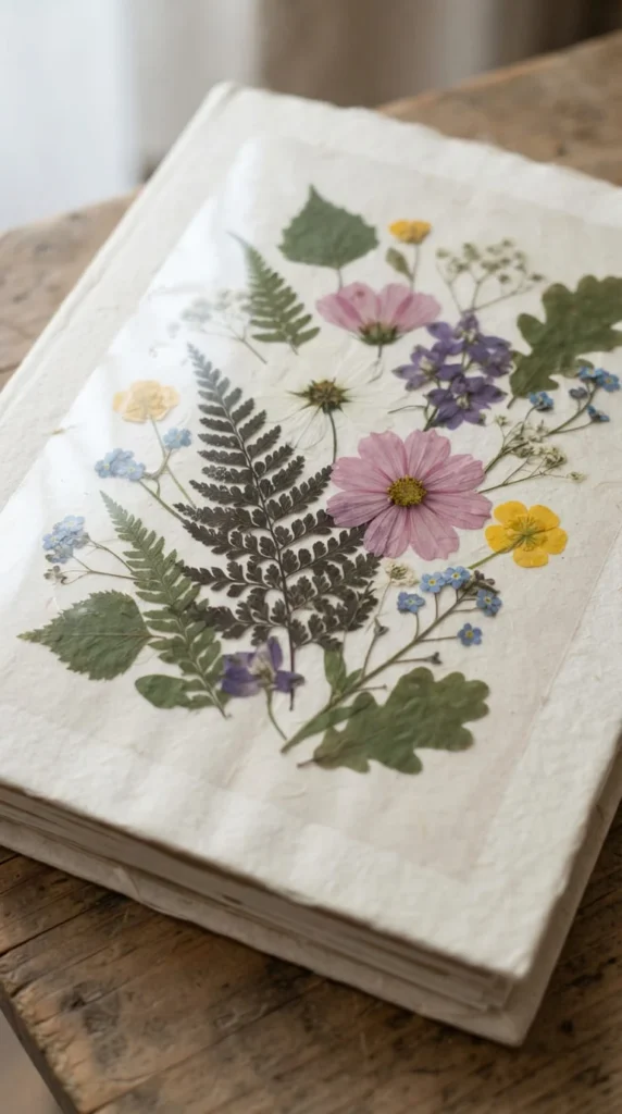
Real pressed flowers add a texture and softness that printed floral paper can’t quite match, and they turn the cover into something that feels genuinely grown rather than manufactured.
Press flowers ahead of time between heavy books or in a flower press for at least a week or two — rushing this step usually leaves them too moist, which can stain the paper underneath once glued down. Ferns, small daisies, and thin petals like pansies press more reliably than thick, fleshy blooms.
Arrange the pressed pieces on the cover before gluing anything permanently, since botanical layouts often look better slightly asymmetrical rather than perfectly centered — think of how plants actually grow rather than a formal bouquet shape. A dab of clear-drying glue on the back of each piece, applied with a toothpick for precision, keeps petals from shifting during the pressing-down process.
Covering the finished arrangement with a thin sheet of vellum or clear acetate protects the delicate pieces from crushing or fading once the album gets handled regularly. This style pairs naturally with garden journals, wedding albums, and nature-focused memory books, and it ages beautifully as the pressed colors mellow slightly over the following months.
4. Pick A Soft, Sun-Faded Palette Before You Touch Any Paper
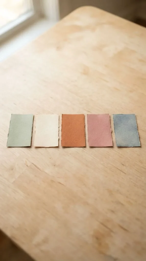
Choosing your colors before you start cutting saves a surprising amount of backtracking later, since mismatched paper is one of the most common reasons a finished cover feels off even when the layout itself is solid.
Muted, warm tones — sage green, cream, terracotta, dusty rose, and faded blue — tend to photograph well and feel calm rather than loud, which is part of why they show up so often in well-received scrapbook covers. Pull three to four colors from this kind of palette rather than trying to use everything you own; a limited palette almost always looks more cohesive than a wide one.
Lay your chosen papers side by side before committing to a layout, and check how they look together in the same lighting you’ll be working under, since colors can shift noticeably between daylight and indoor lamps. If you’re working from patterned paper rather than solids, pull your palette from the pattern’s dominant background color rather than its brightest accent.
Keeping a small swatch card of your chosen palette taped inside your craft supplies makes it much easier to stay consistent if you’re building a cover over several sessions rather than in one sitting.
5. Pair A Bold Serif Title With A Script Accent Word
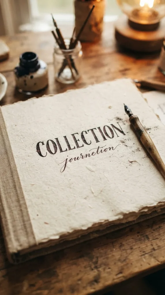
Mixing two typography styles on one cover — rather than sticking to a single font throughout — gives the title more visual interest without needing any extra embellishment.
Use a bold serif for the main title, since serif letterforms read as more editorial and grounded, especially at a larger size. Then add a single word or short date in a lighter script or handwritten style beneath or beside it — a year, a location, or one meaningful word works better here than a full sentence, which can start to look cluttered next to a bold title.
Stick to two typefaces maximum on the cover itself. A third font usually starts competing with the first two rather than adding anything, and it’s one of the fastest ways to make a otherwise clean cover look uneven.
If you’re hand-lettering rather than printing, sketch the layout in pencil first and erase as needed before committing to ink or marker — title placement is hard to fix once it’s inked directly onto your final cover material. This typography pairing works across almost every aesthetic on this list, from vintage to minimalist, since it’s really a structural choice rather than a specific style.
6. Layer A Vellum Overlay For Quiet Depth
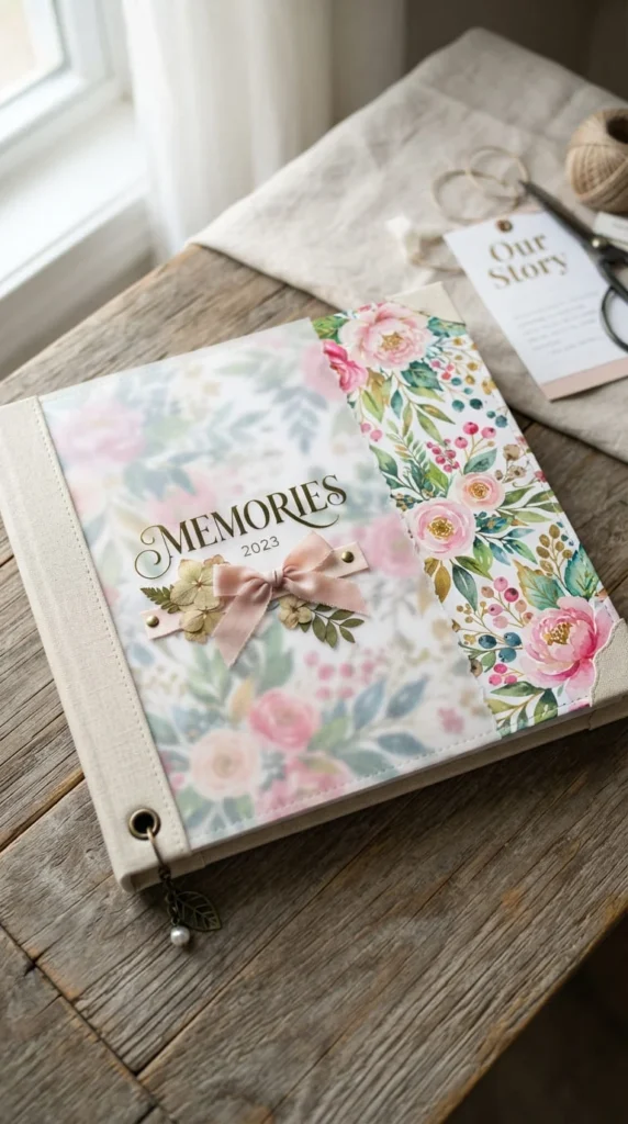
Vellum adds a layer of visual depth without adding visual weight, which makes it a good option if you want a cover that feels layered but still calm rather than busy.
Cut a sheet of vellum slightly smaller than your base cover, then attach it using small corner tabs, brads, or a thin strip of double-sided tape along one edge only — full-surface glue tends to wrinkle vellum and creates visible lumps once it dries. Placing the vellum over a busier patterned paper actually softens that pattern, letting it show through as a muted background texture rather than a bold focal element.
A title or a small photo can sit either fully under the vellum, giving it a frosted, slightly obscured look, or on top of it for a crisper finish — try both before gluing anything down permanently, since the effect changes quite a bit depending on which layer goes where.
Vellum works particularly well for minimalist and understated maximalist covers, where you want the sense of layering without the visual clutter that comes from stacking multiple solid papers. It’s also a forgiving material to redo, since a single strip of tape is much easier to remove and reposition than a fully glued layer.
7. Build A Shaker Pocket Window
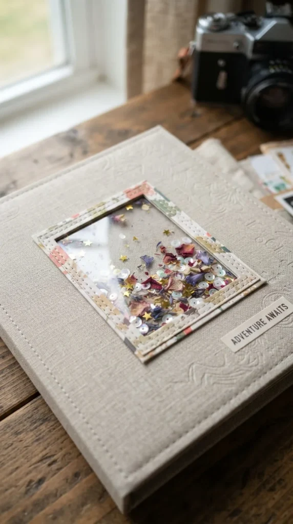
A shaker pocket is one of the more interactive cover ideas here — a small sealed window filled with loose lightweight bits that shift and settle every time the album is picked up.
Cut a window into your cover material, then build a shallow frame around the opening using foam tape or a thin cardboard spacer, which creates the gap needed for the contents to move freely. Cover the front with a piece of clear acetate, sealing the edges carefully so nothing leaks out later.
Fill the pocket with something lightweight — tiny paper confetti, dried flower petals, sequins, or even small printed labels — before sealing the back of the frame closed. Keep the fill relatively sparse rather than packed tight, since a shaker window only really works when the pieces have room to actually move around inside it.
This works well as a small accent element rather than the whole cover design — a corner shaker window paired with a photo and title elsewhere balances the interactive detail against a clean overall layout. It’s a nice fit for birthday albums, celebration scrapbooks, or any cover where a bit of movement and texture adds personality without overwhelming the design.
8. Cut A Custom Monogram With A Cutting Machine
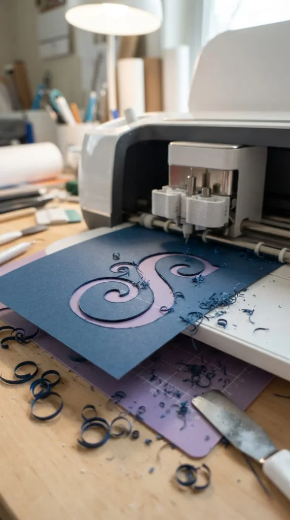
If you own a cutting machine, monogram letters and custom silhouettes give you a level of precision that’s genuinely difficult to match with scissors and a craft knife alone.
Design your monogram or shape in the machine’s software first, checking the proportions against your actual cover size before cutting — a shape that looks right on screen can end up too large or small once it’s physically placed. Cardstock in a contrasting color to your base cover reads more clearly than a shade too close to the background, especially from a slight distance.
Beyond monograms, the same tool works well for cutting clean silhouettes — a simple outline of a landmark for a travel album, an outline of a favorite flower, or a repeating pattern along one edge of the cover. Layering a cut shape slightly raised on foam adhesive adds a bit of dimension compared to gluing it completely flat.
If you don’t own a cutting machine, many craft stores offer access to one, or you can order custom die-cut shapes online in small batches. Either way, the clean edges this method produces are hard to replicate by hand, which makes it worth the extra step for a cover you plan to keep long-term.
9. Design A Travel Journal Cover With Maps And Tickets
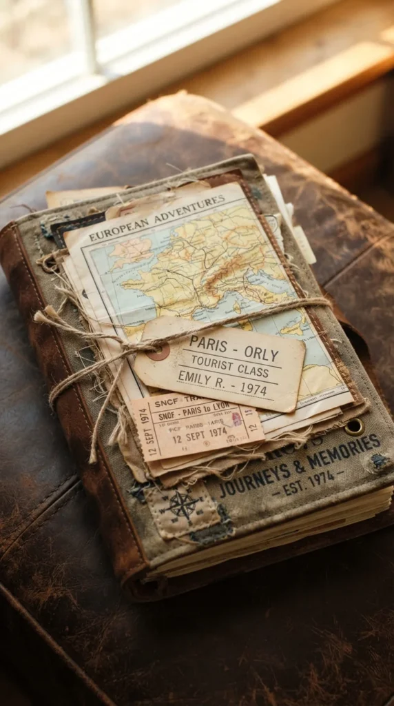
A travel album cover practically designs itself once you start collecting the small paper items that come with any trip — tickets, boarding passes, luggage tags, and maps all carry their own built-in texture and story.
Instead of buying decorative map paper, use a section of a real map from the destination if you have one, cut to fit the cover and trimmed at an angle for visual interest rather than a straight edge. Layer an actual ticket stub or boarding pass on top, slightly overlapping the map, and finish with a luggage tag hanging from a short length of twine at one corner for a bit of dimension.
Keeping the color palette tied to the destination — sandy tones for a desert trip, blues and greens for a coastal one — ties the cover visually to the content before a reader even opens the first page.
This approach works whether you’re covering a single trip or an ongoing travel journal spanning several years; for an ongoing journal, consider a removable pocket for the ticket so you can swap it out as the years and trips change, keeping the base cover intact while updating the details underneath.
10. Go Cottagecore With Gingham And Pressed Herbs
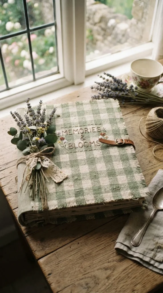
Gingham fabric brings a warm, homespun feel that pairs naturally with dried herbs and soft, muted colors — a combination that’s become a strong identity of its own rather than just a subcategory of vintage.
Stretch a piece of gingham fabric over the cover base, securing the edges to the back with fabric glue or a few strategic staples if the cover material allows it. Small dried herb sprigs — lavender, rosemary, or dried baby’s breath — glued along one edge or scattered lightly across a corner add texture and a faint, pleasant scent that lingers for a surprising while.
A handwritten title in a soft brown or green ink suits this style better than a bold printed font, since the whole aesthetic leans toward something that looks gathered rather than manufactured. Small twine bows or a single button as a closure detail round out the look without adding much bulk.
This style fits garden journals, farmhouse-themed memory books, or a general nature-focused scrapbook particularly well, and it’s forgiving of slight imperfections — a slightly uneven fabric stretch or an asymmetrical herb placement actually reads as more authentic within this particular aesthetic.
11. Try A Dark Academia Cover With Leather And Brass
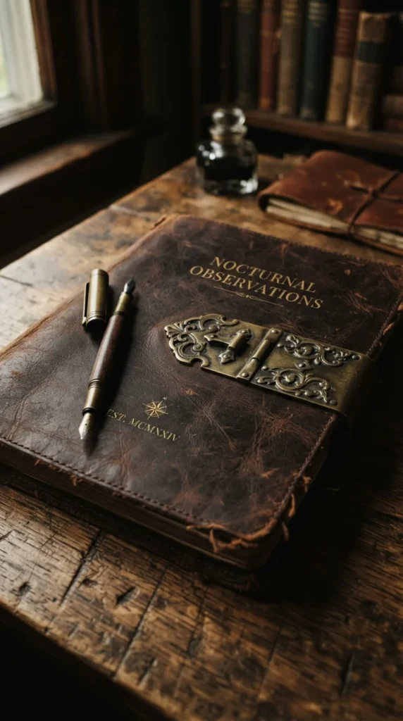
Dark academia trades the soft, pastel palette of most scrapbook aesthetics for something moodier — deep browns, muted greens, and small brass or gold hardware details that feel closer to an old library book than a craft project.
A faux leather or leather-look paper base gives you the right texture without the cost or difficulty of working with real leather. Add a small brass corner protector or a decorative clasp, both available cheaply from craft or hardware suppliers, to reinforce the antique-book feel at the corners and closure point.
Typography here leans toward classic serif fonts or old-style handwriting rather than anything playful or rounded. A single embossed or debossed detail — pressed into the cover with a stylus and a stencil — adds texture that catches light differently depending on the angle, which suits the moodier lighting this style tends to be photographed in.
This aesthetic works particularly well for journals centered on reading, writing, or academic milestones, and it holds up nicely as a cover that doesn’t need much color coordination inside, since the darker exterior sets an intentionally different tone from the lighter palette most scrapbook interiors use.
12. Keep It Clean-Girl Simple With Cream And Glass
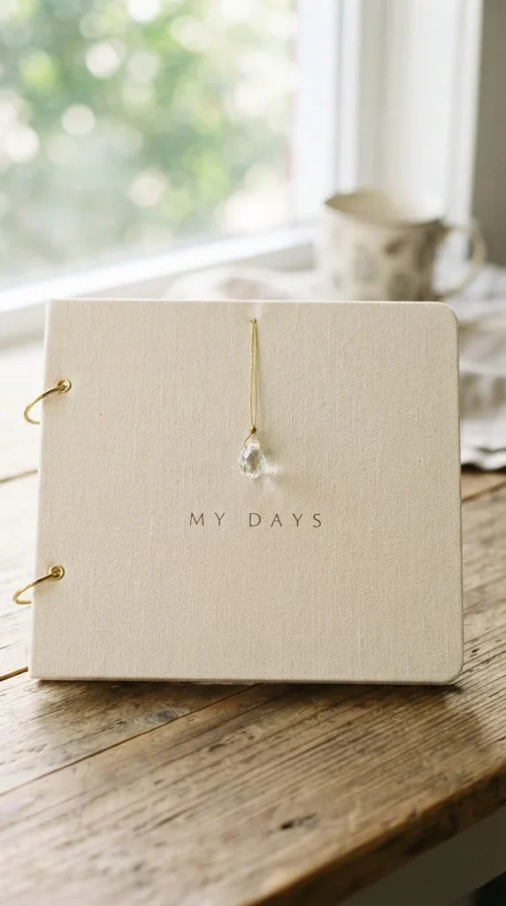
The clean-girl aesthetic strips a cover down to its simplest, most polished form — think soft neutrals, a bit of glossy shine, and almost no visible clutter at all.
A base of smooth cream or off-white cardstock, paired with a single small glass or acrylic charm attached by a thin gold thread, captures the look without needing more than a couple of materials. Skip textured or patterned paper entirely here — the whole point is a surface that reads as smooth and considered rather than layered.
A thin gold foil line along one edge, applied with a foil pen rather than a full sheet, adds just enough shine without tipping into anything ornate. If you’re adding a title, keep it small and centered or tucked into a lower corner rather than as a large focal element competing with the simplicity of the rest of the cover.
This style photographs particularly well in bright, even lighting, which is worth keeping in mind if the finished album is going to be shared online. It also suits readers who want something that feels put-together without spending much time on embellishment — most of the visual work here comes from restraint rather than decoration.
13. Design Digitally First, Then Add Tactile Touches
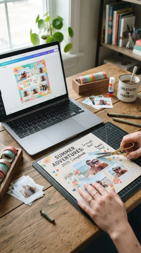
If freehand layout feels intimidating, planning your cover digitally before touching any physical materials takes a lot of the guesswork out of spacing, color, and proportion.
Use a design tool to lay out your title placement, photo size, and color blocks first, adjusting everything on screen where changes cost nothing. Once you’re happy with the digital version, print the background elements — a color-blocked base, a subtle pattern, or even the title itself — directly onto your cover material rather than trying to recreate the whole thing by hand.
From there, add physical texture on top of the printed base: a real photograph instead of a placeholder, a strip of washi tape, a pressed flower, or a small handwritten note. This hybrid approach gives you the precision of digital design with the warmth and texture that a fully digital cover can’t provide on its own.
This method works especially well if you’re prone to overthinking layout decisions, since a digital draft lets you try several versions quickly before committing to cutting or gluing anything permanently. It’s also a practical option if you want multiple covers to share a consistent visual style across a series of albums.
14. Build A Cover From Recycled Paper And Old Cards
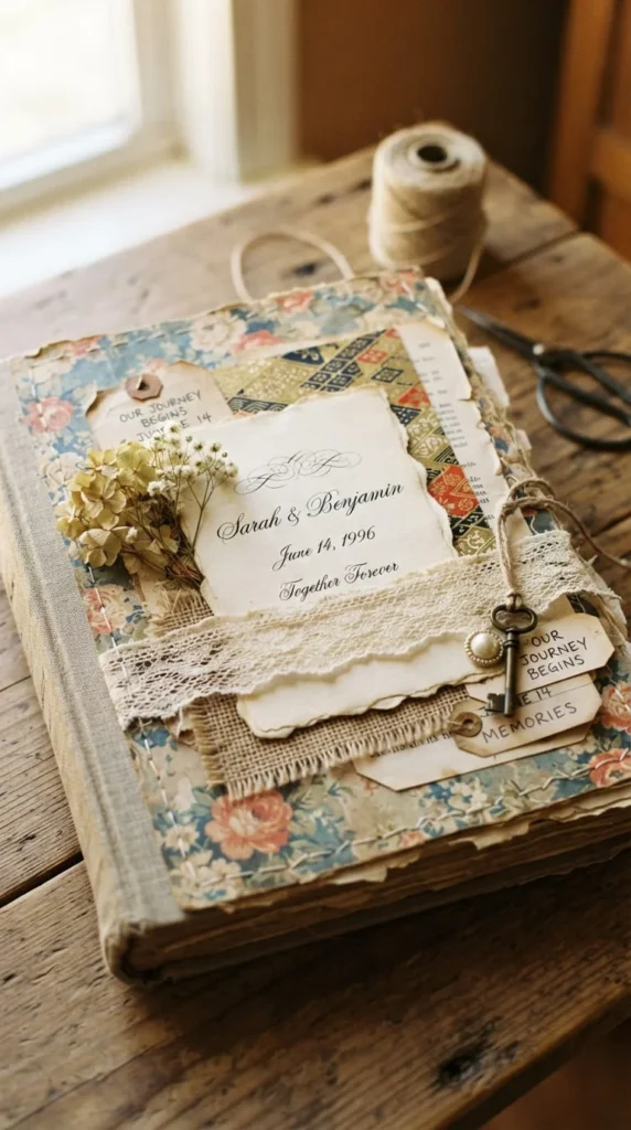
Some of the most personal-looking covers come from materials that already carry meaning — old greeting cards, leftover wedding invitations, or wrapping paper saved from a memorable gift.
Sort through cards or paper you’ve already kept for sentimental reasons, and pull whichever pieces share a color or pattern that could work together on one cover. Cutting cards apart to use just a corner or a printed detail, rather than the whole card, often works better than trying to fit an entire card onto a cover unmodified.
Layering torn pieces at slightly different angles, rather than cutting everything into neat rectangles, gives the collage a more organic, gathered look that suits recycled materials better than a rigid grid layout would. A thin coat of matte sealant over the finished collage protects the different paper weights and finishes evenly, since mismatched papers can otherwise age or yellow at different rates.
This approach costs almost nothing beyond glue and sealant, and it gives an album a genuinely personal history before you’ve even added your own photos — the cover itself is already made from memories.
15. Mat Your Photo For Instant Visual Hierarchy
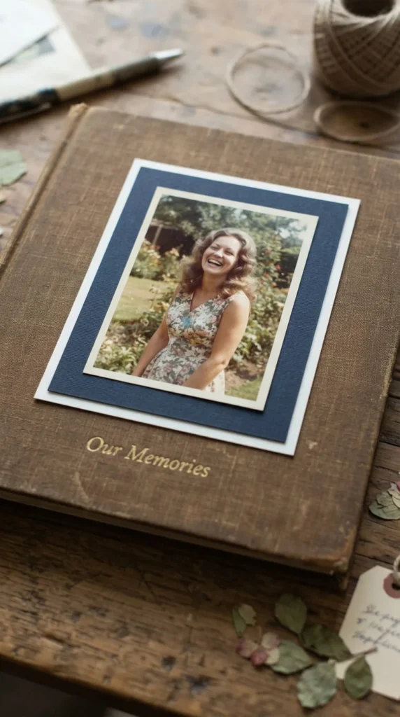
Matting — mounting a photo onto one or two slightly larger layers of paper before attaching it to the cover — is a small step that makes a noticeable difference in how finished a cover looks.
Choose a mat color that contrasts gently with both the photo and the background cover, rather than matching either one exactly, since contrast is what makes the photo pop forward visually. A double mat — a thin white or cream border directly around the photo, then a second colored layer around that — adds even more depth without much extra effort.
Keep the mat borders even on all sides; an uneven border, even by a few millimeters, is one of those small details that reads as sloppy even when the rest of the layout is solid. A ruler and a sharp paper trimmer make this far easier than eyeballing it with scissors.
This technique works on virtually any aesthetic covered elsewhere in this list — vintage, minimalist, botanical, or otherwise — since matting is really a structural framing choice rather than a specific style. It’s one of the simplest upgrades you can make to a photo-centered cover that otherwise feels flat.
16. Add Gold Foil Accents Without Overdoing It
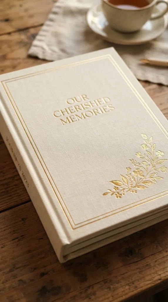
A little gold foil goes a long way, and used sparingly it reads as a premium detail rather than a distraction from the rest of the cover.
A foil pen is the easiest entry point — trace a thin border around your title, along one edge of the cover, or around a small illustration for a subtle metallic outline that catches light without needing any special equipment. For a bolder look, a small foiled floral detail or a single foiled monogram in one corner adds shine in a contained space rather than across the whole surface.
If you’re using foil transfer sheets with a laminator or heat tool, practice on scrap paper first — the transfer process takes a bit of trial and error to get consistent coverage, and it’s much easier to waste a scrap sheet than to redo a finished cover.
Pairing gold foil with a cream, deep green, or navy background tends to look more intentional than pairing it with something already bright or busy, since the metallic detail needs a calmer surface to actually stand out against. Used this way, foil accents work well across several of the aesthetics covered earlier — vintage, clean-girl, and dark academia in particular all take well to a restrained metallic touch.
17. Wrap A Cover In Book Cloth Or Linen
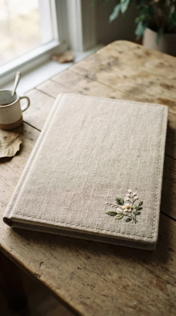
Fabric-wrapped covers have a tactile quality that paper simply can’t replicate, and they tend to hold up better over years of handling than a fully paper-based cover.
Book cloth, available from craft and bookbinding suppliers, is designed specifically for this kind of wrapping and comes pre-treated to resist fraying at cut edges. Plain linen or cotton fabric works too, though raw edges will need a thin line of fabric glue or a folded hem to prevent unraveling over time.
Stretch the fabric over your cover base, wrapping the excess around to the back and securing it with strong adhesive or a few small staples, pulling firmly enough to avoid loose wrinkles across the front. A small embroidered detail, a fabric patch, or a single button sewn on afterward adds a personal touch without disrupting the smooth wrapped surface.
This technique suits memory books meant to last for decades — baby books, wedding albums, or family history projects — since fabric wears more gracefully than paper and tends to soften slightly with age rather than becoming brittle. It’s a bit more labor-intensive than a paper cover, but the durability trade-off is usually worth it for anything you plan to keep long-term.
18. Skip The Glue With A No-Cut Removable Sleeve
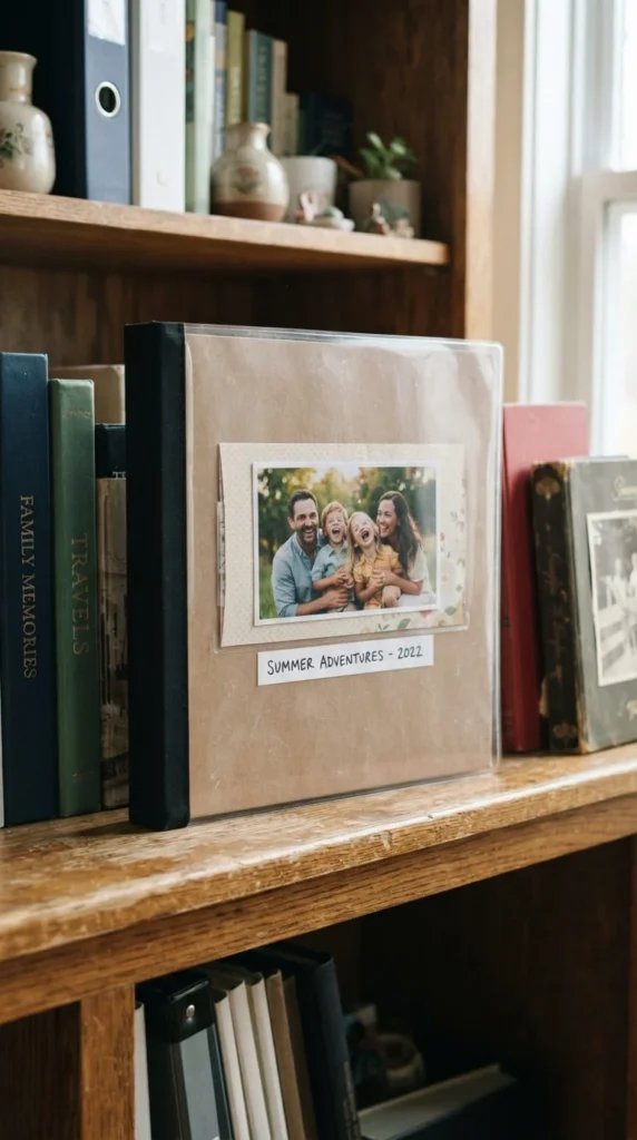
Not everyone wants to permanently alter a scrapbook cover, especially if the album itself is borrowed, rented, or something you might want to redesign later — a removable sleeve solves that without a single drop of glue.
A clear plastic sleeve sized to fit over your album’s cover holds a decorated insert — a printed photo, a piece of patterned paper, or a small collage — completely separate from the album itself. Swapping the insert takes seconds, which makes this a good option for school-year albums, seasonal memory books, or shared family albums where different people might want to update the look over time.
Binder clips or small removable clips at the top and bottom keep the sleeve securely in place without any adhesive touching the actual book cover. If you want a slightly more finished look than a plain plastic sleeve, a fabric or paper pocket sewn or glued only to itself — never to the album — achieves the same reversible effect.
This approach is also worth considering for classroom or group projects, where several students or contributors might want a say in how the shared cover looks without permanently committing to one person’s design choice.
19. Measure Before You Cut Anything
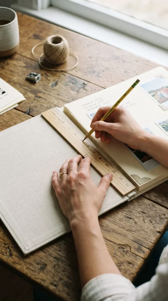
This isn’t the most exciting step on the list, but skipping it is one of the most common reasons a cover ends up looking uneven once everything’s assembled.
Measure the height, width, and spine width of your actual album before cutting any base material, and add a small fold-in allowance — usually about half an inch to an inch on each side — if you’re wrapping paper or fabric around the edges rather than just laying it flat on top. Write these measurements down somewhere you’ll actually find them again, since remeasuring later because you misplaced a sticky note is a common and avoidable delay.
If your album has a thicker spine than a standard book, account for that separately rather than assuming a flat front-and-back measurement will wrap cleanly around the whole cover. A dry run with plain scrap paper, folded and test-fitted before you touch your good materials, catches sizing mistakes while they’re still cheap to fix.
Keeping a small printed template with your standard album dimensions saves time if you’re planning to make several covers in a similar style, since you won’t need to re-measure from scratch each time.
20. Choose The Right Adhesive For Each Material
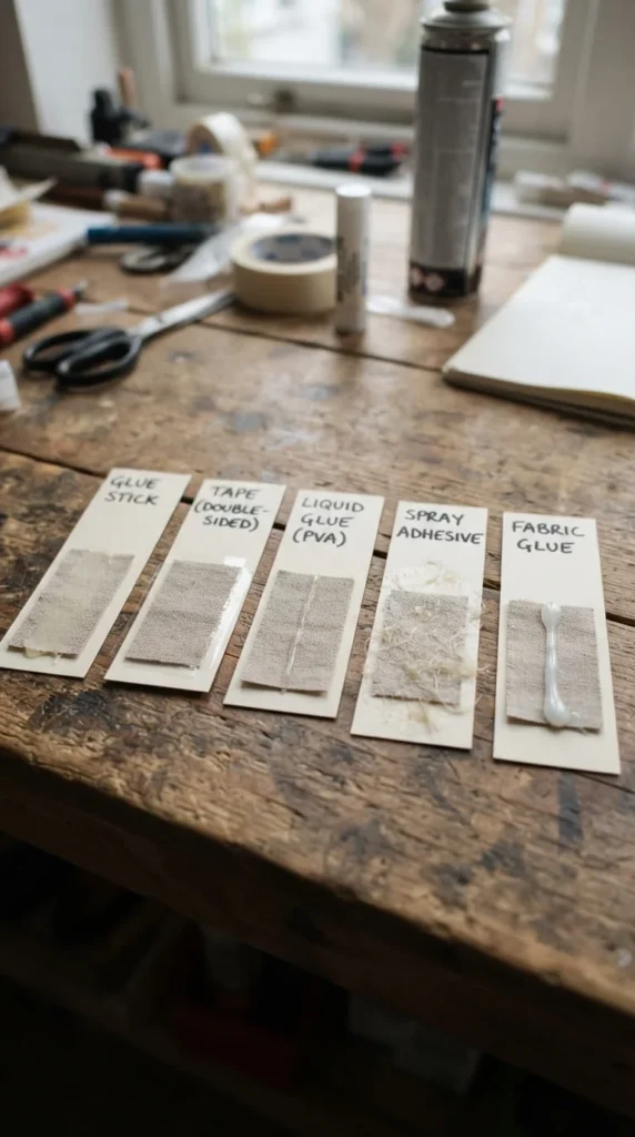
Using the wrong glue is one of the fastest ways to end up with wrinkled paper, curling fabric edges, or embellishments that fall off within a few weeks — and different materials genuinely need different adhesives.
A glue stick works fine for flat paper-on-paper layering but struggles with anything textured or heavier. Double-sided tape holds vellum and acetate without the wrinkling risk that liquid glue brings to those thinner materials. Fabric glue is worth keeping on hand specifically for lace, linen, or book cloth, since regular craft glue can soak through fabric and leave visible stains. Liquid craft glue or a hot glue gun handles dimensional embellishments — buttons, small charms, or thicker cardstock shapes — that flatter adhesives can’t support.
Testing a small scrap of each material with your intended adhesive before committing to the full cover takes a couple of minutes and avoids a frustrating redo later. Applying adhesive in thin, even layers rather than thick blobs also reduces wrinkling and bubbling across almost every material type, which is often a bigger factor in a clean finish than which specific glue you chose.
21. Seal And Protect The Finished Cover
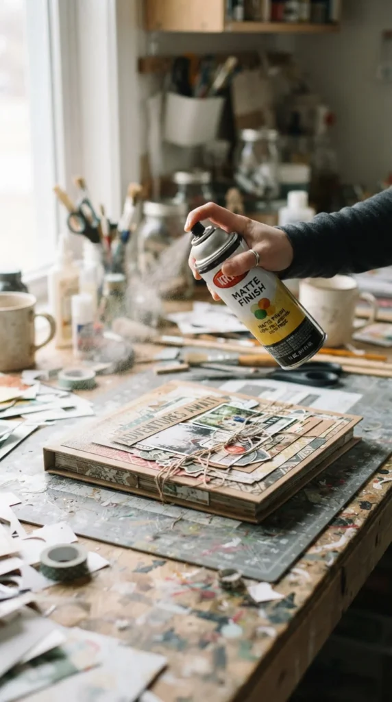
A finished cover that looks great today won’t stay that way without some kind of protective finish, especially if the album is going to be handled regularly rather than displayed and left alone.
A matte sealant spray protects the surface without adding shine, which suits most of the softer, muted aesthetics covered earlier in this list. A glossy or satin finish works better if your cover already leans toward a polished, clean-girl or modern look, since the added shine complements rather than clashes with that style. Avoid switching finishes halfway through a single cover — applying matte over one section and glossy over another usually looks like an inconsistency rather than an intentional design choice.
Test any sealant on a scrap piece first, since some sprays interact unpredictably with certain inks or dyes, occasionally causing slight color shifts or smudging. Let the first coat dry fully before adding a second if extra durability is needed, rather than layering wet coats on top of each other.
For covers with delicate elements like pressed flowers or vellum, a light touch with the sealant — holding the can farther back and applying in short passes — protects the surface without flattening or crushing anything fragile underneath.
22. Build A Removable Seasonal Refresh Sleeve
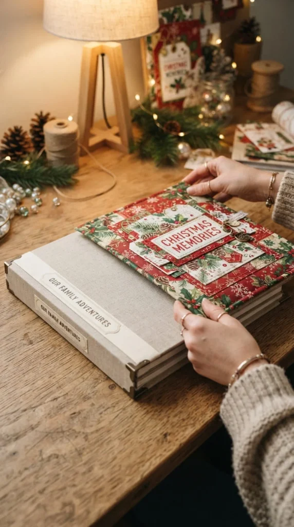
If you like the idea of updating a cover’s look throughout the year without redesigning the whole album each time, a removable overlay sleeve lets you keep one sturdy base cover and simply swap what sits on top of it.
Build a plain, durable base cover first — something neutral enough to work under several different overlay themes. Then create a few separate thin overlay panels, each decorated for a specific season or occasion, attached using small tabs, ribbon ties, or hidden magnets rather than permanent glue. Swapping one overlay for another takes just a minute or two once the attachment system is in place.
This setup works particularly well for a family memory album that gets added to year after year, where a holiday-themed overlay might come out in December and a simpler everyday version stays on the rest of the year. It also solves the problem of a cover feeling permanently locked into one aesthetic choice you might grow tired of.
Keep the attachment points sturdy enough to survive repeated swapping, since a flimsy tab or a weak magnet will wear out well before the album itself does.
Conclusion
A scrapbook cover doesn’t need to be complicated to look intentional — most of the ideas here come down to picking one clear focal point, choosing a handful of materials that actually suit each other, and taking the extra few minutes to measure, seal, or mat something properly instead of rushing straight to glue. Try picking just one or two ideas from this list rather than combining everything at once; a cover built around a single clear idea almost always reads better than one trying to do five things simultaneously. Pull out whatever materials you already have on hand, pick the aesthetic that matches the memories you’re preserving, and start with the base layer today — the rest of the cover tends to come together once that first decision is made.