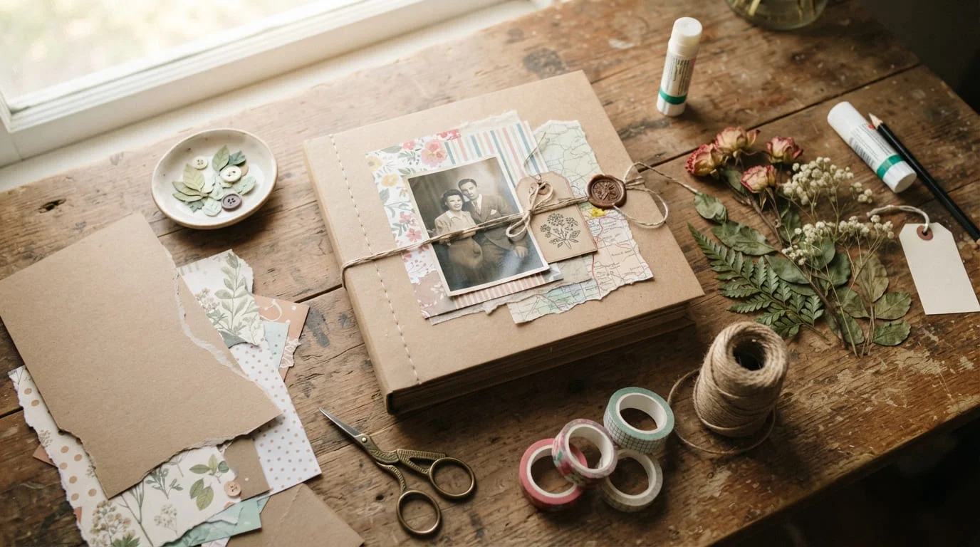
A blank scrapbook cover has a way of staring back at you. You’ve filled the pages with photos, ticket stubs, and little notes, but the front still looks unfinished. The good news is that a cute, Pinterest-worthy cover doesn’t need fancy tools or hours of free time. It just needs a plan.
This guide walks through the exact techniques crafters use to turn a plain cover into something that looks pulled together, plus a few mistakes worth avoiding along the way.
Start With One Focal Point
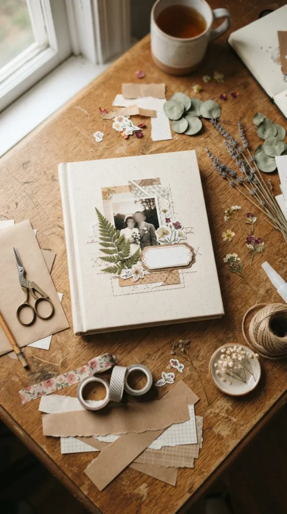
Every cover that looks intentional has one thing your eye lands on first. That could be a single photo, a hand-lettered title, or a bold shape. The mistake most people make is trying to fit everything on the cover at once, which ends up looking crowded instead of curated.
Pick one main element and build everything else around it. If you’re using a photo, choose your sharpest, most meaningful shot rather than the first one you find. If you’re going with a title, keep it short — a name, a year, or a single word works better than a full sentence.
Leave open space around your focal point. That blank margin isn’t wasted room. It’s what makes the design feel calm instead of busy, and it’s one of the simplest ways to make an amateur cover look more finished.
Pick a Small, Repeatable Color Palette
Covers that feel chaotic almost always have too many colors competing for attention. Stick to three or four shades total — one dominant color, one supporting tone, and one or two small accents.
A quick way to choose:
- Pull your main color from your photos or theme
- Add a neutral (cream, kraft brown, soft white) to balance it
- Use one accent color sparingly, just for small details like ribbon or stitching
This keeps the whole cover feeling connected, even if you’re combining several different materials like fabric, paper, and stickers.
Add Texture With Fabric or Kraft Paper
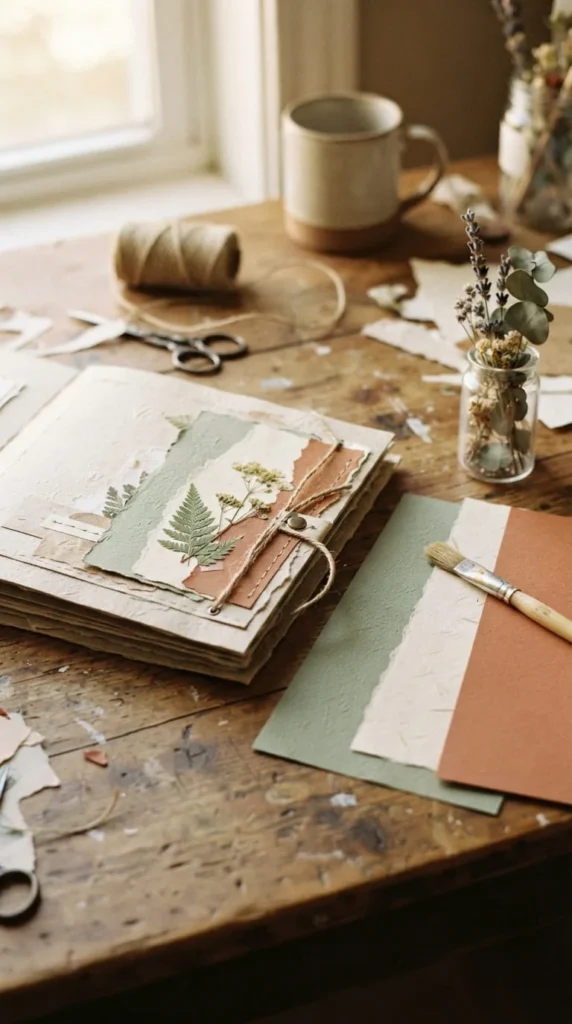
Flat cardstock photographs fine, but texture is what makes a cover feel handmade rather than printed. Wrapping your cover in a scrap of linen or cotton fabric is a favorite trick among scrapbookers, and it holds up better over time than plain paper.
If fabric feels like too much, kraft paper is an easier starting point. Rubbing a little distress ink along the edges instantly gives it a soft, aged look that pairs well with vintage or travel-themed albums.
Either option gives your cover a tactile quality that photographs beautifully for Pinterest — the slight texture catches light in a way flat paper never does.
Use Vinyl or Stickers for Clean Lettering
Hand lettering looks lovely, but it’s not for everyone, and shaky handwriting can undercut an otherwise polished cover. Adhesive vinyl lettering is a reliable shortcut if you own a cutting machine, or you can use pre-cut alphabet stickers instead.
A few tips that make a real difference:
- Lay your title out with removable tape first so you can check spacing before committing
- Center it against your focal photo, not the whole cover, so it lines up visually
- Layer your title over a small strip of contrasting cardstock for subtle depth
That last trick — layering vinyl over a slightly larger piece of colored paper — is a small detail that makes titles look designed rather than slapped on.
Frame Your Photo With a Simple Mat
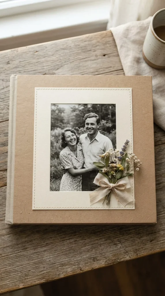
If your cover centers on one photo, matting it changes everything. Cut a piece of cardstock slightly larger than your photo, center the photo on top, and glue both down together. The thin border draws the eye and makes even an average photo look like the focal point of a finished design.
Pair a mat with one small cluster of embellishments — a few paper flowers, a ribbon bow, or a cluster of buttons — placed off to one side rather than centered. Asymmetrical placement almost always looks more natural than perfectly symmetrical arrangements.
Finish With a Protective Seal
Once your cover is glued and arranged, a thin coat of matte sealer protects your work from smudges and fingerprints without adding glare. This step is easy to skip, but it’s the difference between a cover that lasts through years of handling and one that starts peeling within months.
Let everything dry completely before sealing, and work in light coats rather than one heavy layer.
Bringing It All Together
A great scrapbook cover doesn’t come from using every supply in your craft box. It comes from choosing one focal point, sticking to a small color palette, adding a little texture, and finishing with clean details like matting and sealing.
Start small if you’re new to this — even one textured background and one well-placed photo can make a cover feel complete. Save this guide for later and try these ideas when you’re ready to give your next album the cover it deserves.