Picking the right scrapbook cover idea is often the part people get stuck on the longest. You have finally sorted your photos, picked your paper, and maybe even finished a few pages inside — and then the cover sits blank for weeks. A scrapbook cover sets the tone for everything inside it, so it deserves more than a leftover piece of cardstock and a title sticker. This list walks through 22 scrapbook cover ideas that range from five-minute weekend projects to more detailed keepsake designs, covering different themes like travel, family, weddings, and baby milestones. Whether you are working with a store-bought album or building your own from scratch, you will find a direction here that matches your photos, your materials, and how much time you actually have to spend on it.
1. Layer a Photo Collage Across the Whole Cover
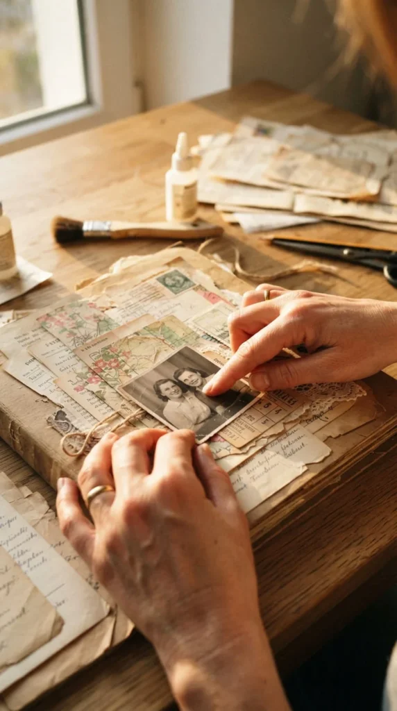
A full-cover photo collage is one of the most personal ways to open your album. Instead of choosing one hero photo, you print several smaller images — some in color, some in black and white — and arrange them in overlapping layers across the entire front panel.
Start by picking a mix of close-up and wide shots so the cover doesn’t feel flat. Trim a few photos into circles or arches to break up the usual rectangle pattern. Leave small gaps between images and fill them with torn paper strips or a strip of patterned washi tape.
This works especially well for year-in-review albums or trip recaps, where you want the cover to hint at everything the reader is about to see. Keep your photo edges slightly overlapping rather than perfectly aligned — it gives the collage a handmade feel instead of looking like a printed collage template.
If you’re short on printed photos, mix in ticket stubs, postcards, or small handwritten notes between the images. That combination of memory and ephemera makes the cover feel lived-in rather than staged.
2. Design a Vintage Postcard-Style Cover
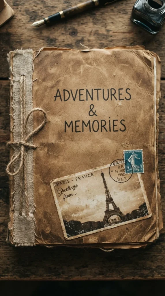
If your album leans toward travel or heritage photos, a postcard-style cover gives it an instant sense of place. Choose a warm, aged base color — think buttermilk, warm brown, or aged cream — and add a single central photo framed like a postcard, complete with a thin border.
Add a stamped-look corner element, either a real vintage stamp reproduction or a hand-drawn one, along with a postmark stamp near it. A short handwritten line across the bottom, like a location and date, finishes the look without needing a full title.
This cover style works particularly well with warm neutral palettes that have been popular in recent scrapbooking trends, since aged creams and golden ambers read as nostalgic rather than dated. Distress the paper edges lightly with a bit of ink or a gentle tear for texture.
Postcard covers are also forgiving for beginners because the layout is simple: one photo, one border, a few small details. You don’t need advanced paper-cutting skills to make it look intentional.
3. Press Real Botanicals Into the Cover
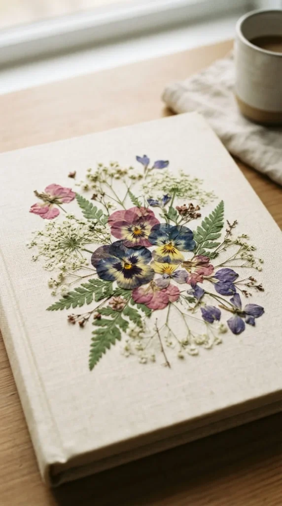
Pressed flowers and leaves add texture you simply cannot get from printed paper. If you have access to a flower press, or even just a heavy book and some parchment paper, you can press petals, ferns, or small leaves over a few weeks and use them directly on your cover.
Arrange the pressed botanicals along one edge or in a loose scattered pattern across a corner. Seal them under a light coat of decoupage glue or a clear laminate sheet so they don’t crumble over time.
This idea pairs naturally with earthy, grounded color schemes — think olive green, light taupe, and vanilla tones — for a calm, nature-led feel. It’s a strong choice for spring albums, garden photography, or anniversary books tied to an outdoor wedding.
One practical tip: press more botanicals than you think you’ll need. Some will break during handling, and having extras means you won’t have to start the pressing process over if your first attempt doesn’t survive assembly.
4. Try a Minimalist Typography Cover
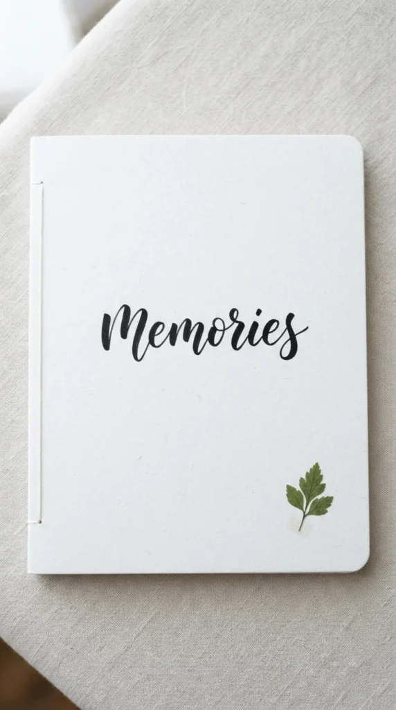
Not every scrapbook cover needs a busy layout. A minimalist typography cover uses one word or short phrase as the entire design, set against a clean, uncluttered background.
Choose a soft off-white or pale neutral base, then hand-letter or stencil a single word — a name, a year, or a phrase like “home” or “us” — in the center or slightly off-center. Keep everything else empty. The negative space is the design.
This approach works well if your photos inside are already busy or colorful, since a quiet cover creates a nice contrast when someone opens the album. It also photographs well if you plan to share your scrapbook on social media, since clean covers tend to look sharper in photos than heavily embellished ones.
Add just one small accent — a tiny pressed leaf, a thin gold line, or a single button — to keep it from feeling unfinished. The goal is restraint, not emptiness. If you’re unsure about your handwriting, print your word in a favorite font, cut it out, and adhere it instead.
5. Wrap the Cover in Fabric
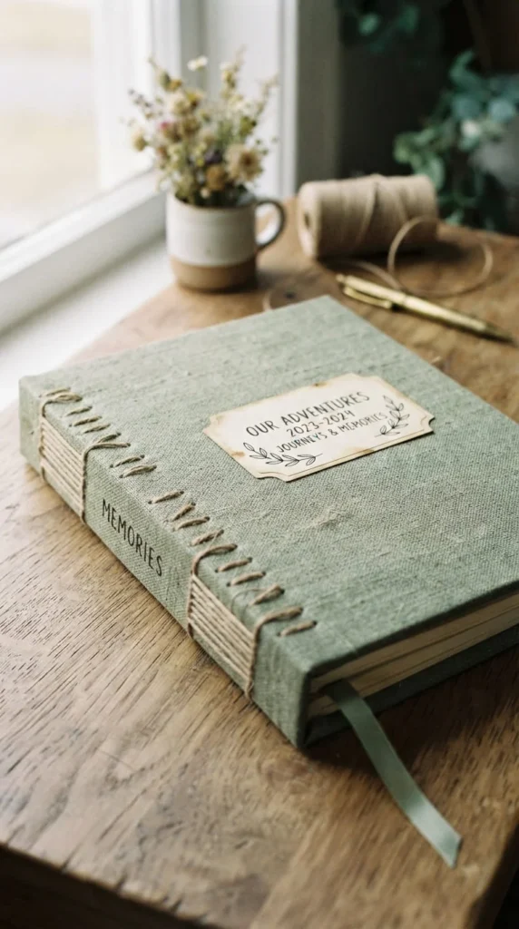
Fabric-covered albums have a softness that paper can’t quite match. Linen, cotton, or even an old scarf can be stretched and glued over a chipboard base to create a textured, tactile cover.
Choose a fabric in a muted tone — sage, dusty rose, or soft taupe work well — so it doesn’t compete with anything you add on top later. Iron the fabric flat before wrapping it around your cover board, and use fabric glue or spray adhesive for a clean finish along the edges.
Once the fabric is set, you can stitch a small title directly onto it with embroidery thread, or pin on a small fabric patch. This idea suits baby books, heirloom albums, or anything meant to be handled often, since fabric holds up better than paper over years of use.
A fabric cover also gives you a soft surface to attach buttons, ribbon ties, or a small charm without worrying about tearing paper. If you want the album to feel like a keepsake rather than a printed product, this is one of the more durable ways to achieve that.
6. Build a Washi Tape Grid Pattern
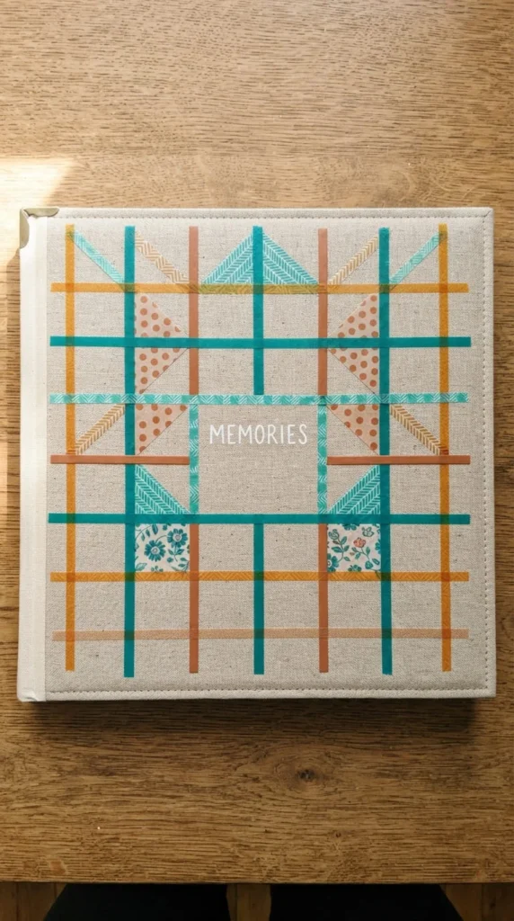
Washi tape is one of the easiest materials to work with if you want a graphic, modern-looking cover without freehand drawing. Lay strips of tape in a simple grid — horizontal and vertical lines crossing at even intervals — across a plain cardstock base.
Pick two or three coordinating tape colors rather than grabbing every pattern in your stash. A deep teal with a clay or amber accent reads as more polished than five mismatched patterns crowded together. Leave one grid square empty for a small photo or the album title.
This idea is genuinely beginner-friendly because washi tape repositions easily if your lines come out crooked the first time. It’s also fast — most people can finish a full grid cover in under twenty minutes.
For added dimension, layer a second thinner strip of tape slightly off-center from your main grid lines. It creates a subtle shadow effect that makes the pattern look more considered than a single flat layer of tape.
7. Add a Hand-Drawn Travel Map
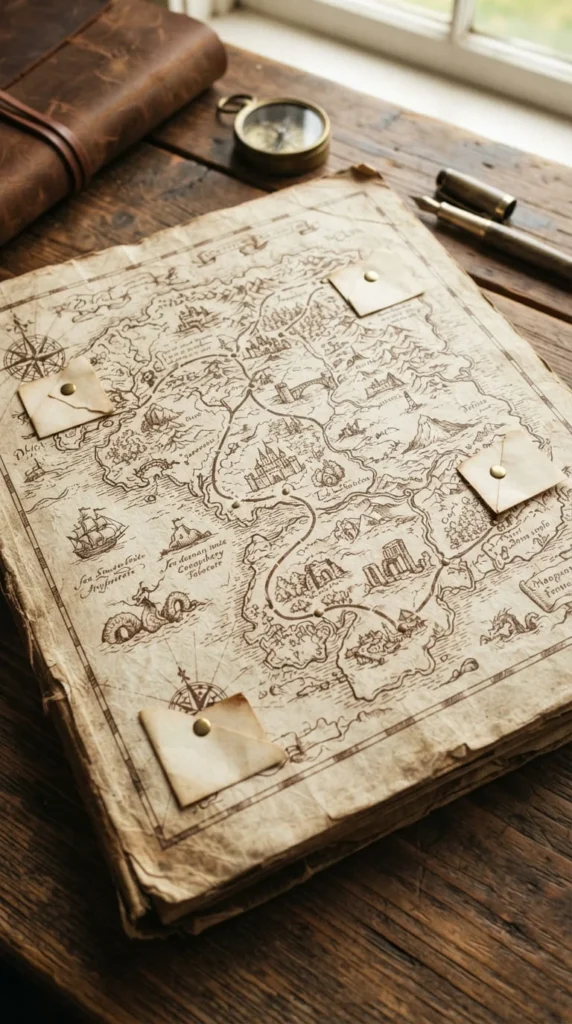
For a trip album, a hand-drawn map cover turns the front of your scrapbook into a preview of the journey itself. Sketch a simplified route or outline of the region you visited directly onto your cover base, using a fine-tip pen in sepia or dark brown ink.
Mark key stops with small dots or tiny photo corners, and pin small printed photos along the route if there’s room. You don’t need to be a skilled illustrator — a loose, imperfect line style actually suits this idea better than a precise one.
This cover concept pairs naturally with a Mediterranean-inspired palette of buttermilk, chocolate brown, and ultramarine blue, which gives the whole album a sun-warmed, well-traveled feel before anyone even opens the first page.
If drawing freehand feels intimidating, trace a simplified map outline from a printed reference using light pressure and a pencil first, then go over your lines in ink once you’re happy with the shape. Erase any visible pencil marks once the ink has fully dried.
8. Attach Mini Photo Pockets
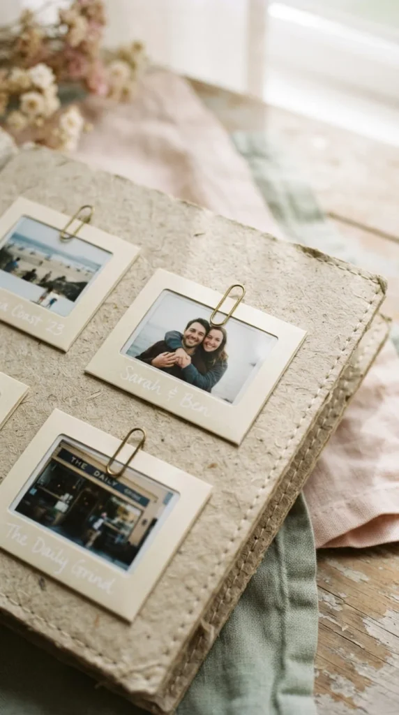
Instead of gluing photos flat, sew or glue small library-style pockets onto your cover and slide in mini printed photos that can be pulled out and swapped. This gives your album a bit of interactivity right from the cover.
Cut two or three small paper pockets from coordinating cardstock, leave the top open, and attach them at slightly different heights across the front panel. Slide in your smallest printed photos — passport-sized prints work well — so they peek out just enough to be visible.
This idea is a nice option if you haven’t fully decided which photo should represent the whole album, since you can change out the visible photo anytime without redoing the whole cover. It also gives visiting family members something to interact with when they pick up the book.
Secure the pockets with a small binder clip, a brass paperclip, or a loop of twine at the top so the photos don’t slip out during handling. This small mechanical detail also adds a nice bit of visual texture to an otherwise flat surface.
9. Feature Hand-Lettered Calligraphy
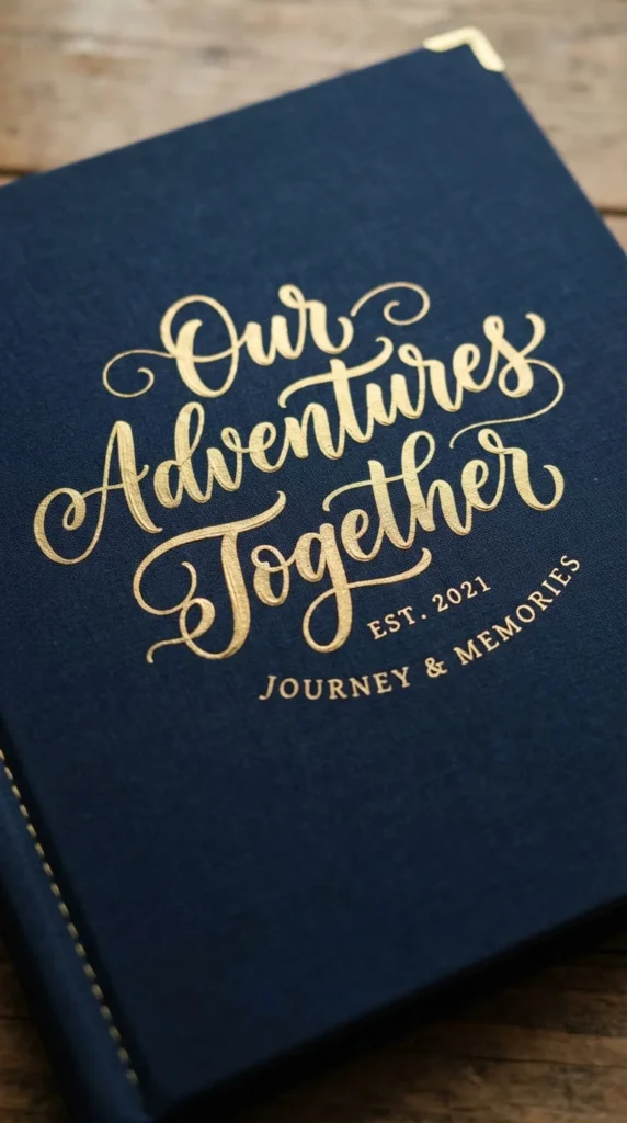
A calligraphy title cover puts the focus entirely on lettering skill rather than photos or embellishments. Choose a short title — a family name, a year, or a phrase — and practice it several times on scrap paper before committing to your final cover.
A deep, moody background like navy or eggplant makes gold or cream ink stand out sharply, giving the cover a formal, almost literary feel. This suits memoir-style albums, wedding books, or anything meant to feel like a finished keepsake rather than a casual scrapbook.
If your calligraphy skills are still developing, use a printed guide sheet underneath your cardstock as a light tracing template, then go over it freehand once you’re confident. Practicing the exact words you’ll use, rather than random letters, helps your spacing come out even on the final attempt.
Keep everything else on the cover minimal so the lettering stays the visual focus. One small flourish — a thin line under the title or a tiny dot accent — is usually enough decoration.
10. Go Rustic With a Leather-Bound Look
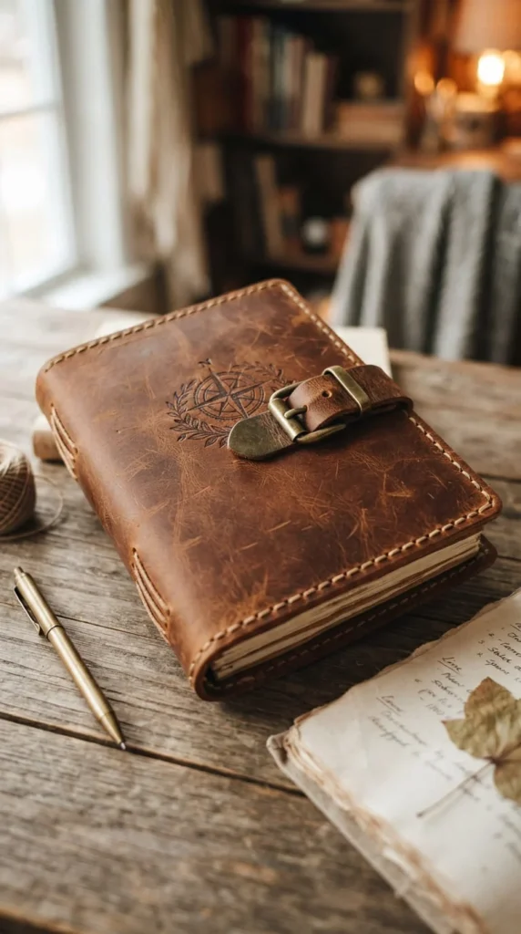
A leather or faux-leather cover gives an album a weightier, more permanent feel, which works well for milestone books meant to be kept for decades — think wedding albums, baby books, or multi-generational family albums.
You can buy pre-made leather-look album covers, or wrap a chipboard base in faux leather sheeting available at most craft stores. Add a simple brass buckle, leather cord tie, or a small embossed initial for detail without overcomplicating the design.
Leather pairs naturally with warm, earthy accent colors, so consider adding a strip of terracotta or amber ribbon as a bookmark tie. Avoid overly bright or pastel embellishments here, since they tend to clash with the material’s natural warmth.
If you’re working with real leather, condition it lightly before use so it doesn’t crack over time, and store the finished album away from direct sunlight to preserve the color. This is one of the more durable cover options on this list, built to handle years of being pulled off a shelf.
11. Create a Chalkboard-Style Cover
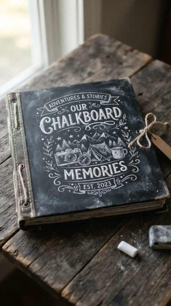
A chalkboard cover uses matte black cardstock or actual chalkboard-textured paper as the base, with a title written in white chalk pen or a chalk-effect marker. It’s a distinctive look that stands out on a shelf full of pastel and cream albums.
Sketch your layout lightly in pencil first if you’re nervous about spacing, then go over it in chalk pen once you’re happy with the placement. Add a small doodle — a simple flower, a star, or a swirl — near the title to fill empty space without cluttering it.
This style works particularly well for school-year albums, birthday books, or anything with a slightly playful, everyday tone. The dark background also makes any metallic embellishments you add, like small gold stars or a thin gold border, pop more than they would on a lighter cover.
Chalk pen ink can smudge if handled too soon, so let it fully cure for at least a few hours, and consider a light coat of clear sealant spray if the album will be handled often.
12. Mark Milestones on a Baby Book Cover
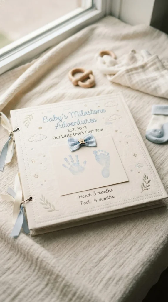
A baby milestone album deserves a cover that feels soft and celebratory from the first glance. Use pale pastel cardstock as your base, and consider including an actual handprint or footprint impression using non-toxic ink pads made for baby keepsakes.
Add the baby’s name and birth date in simple lettering, along with one small accent like a fabric bow, a tiny button, or a felt cutout shape. Keep the palette soft — powder blue, blush pink, or buttery cream all work well and won’t clash with photos taken during different seasons.
If you’re building a first-year album, consider designing the cover to reflect the whole year rather than a single moment, so it doesn’t feel tied to just the newborn stage. A small cluster of stars, clouds, or simple shapes keeps it timeless as the child grows and the album gets pulled out again years later.
Avoid anything with sharp edges, small detachable parts, or metal embellishments if this album will be handled by small hands later — softer materials hold up better and stay safer over time.
13. Design a Monogram Cover for Weddings
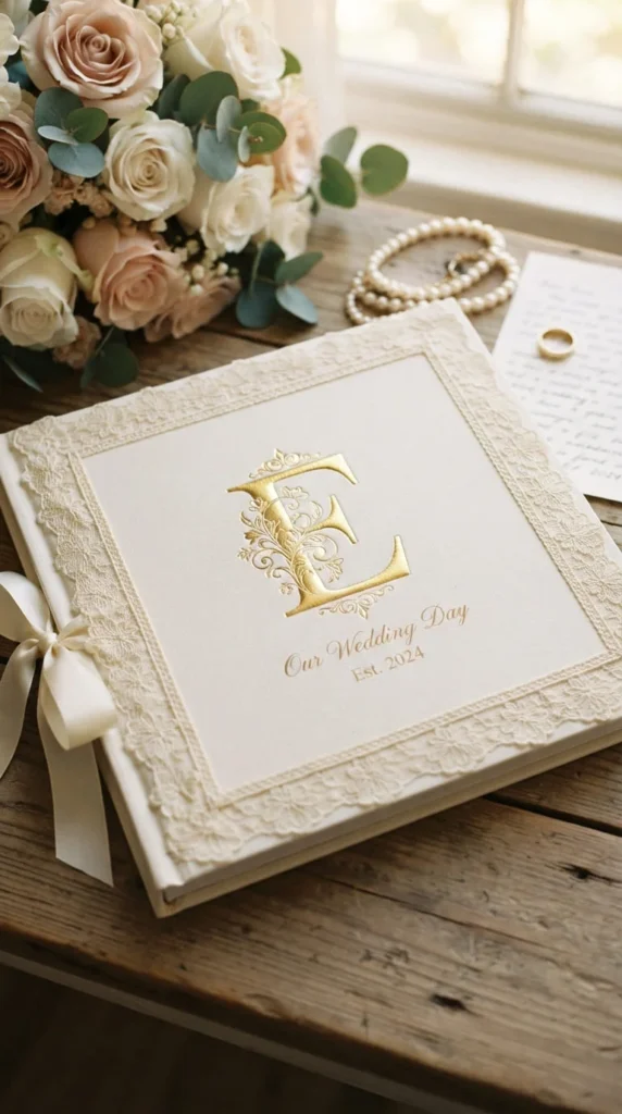
A monogrammed cover is one of the more traditional choices for a wedding scrapbook, and it still holds up because it’s simple, elegant, and doesn’t compete with the photos inside. Center a single large initial — either the couple’s shared last name or interlocking first initials — on an ivory or soft blush base.
Emboss the monogram if you have access to an embossing kit, or use a gold or silver foil sticker for a similar effect without special tools. A thin border of lace, ribbon, or pearl trim along the cover edge adds a bit of texture without overwhelming the design.
Keep the color palette limited to two tones at most — ivory and gold, or blush and silver — so the cover reads as refined rather than busy. This is a cover style where less genuinely does more.
If you want to personalize it further, add the wedding date in small lettering beneath the monogram, using a font that matches your invitation suite if you saved a copy of it for reference.
14. Build an Autumn-Toned Nature Cover
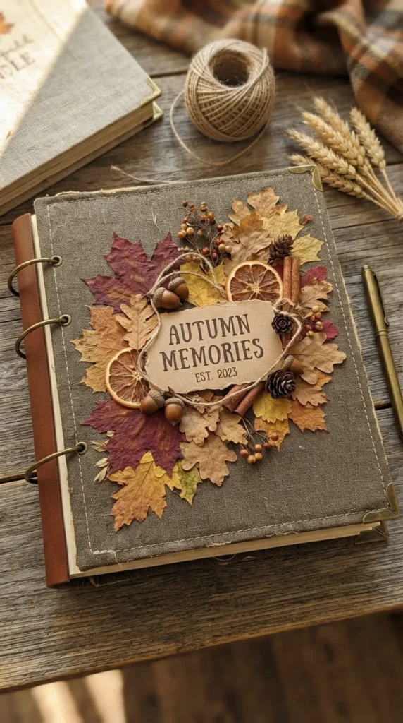
If your album covers a fall season, a harvest, or a family trip during cooler months, lean into warm seasonal tones on the cover itself. Terracotta, deep amber, and warm brown create an immediate seasonal mood before anyone reads a single page inside.
Combine pressed maple leaves, dried orange slices, or small acorns in a loose cluster in one corner rather than spreading them evenly across the whole cover. Asymmetric arrangements tend to look more natural than perfectly centered ones.
A cream or warm off-white base lets the seasonal elements stand out clearly, and it keeps the overall look from feeling too dark or heavy. This palette direction has been especially popular recently as warm neutrals have replaced cooler gray tones in a lot of craft and design trends.
Seal any dried natural materials under a light layer of clear adhesive or laminate so they hold up over repeated handling, especially if this album will be taken out every fall as a seasonal tradition.
15. Paint a Watercolor Wash Background
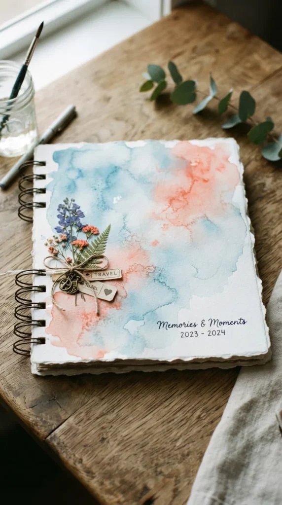
If you enjoy painting, a hand-painted watercolor wash makes for a genuinely one-of-a-kind cover that no template or sticker set could replicate. Wet your cardstock lightly, then drop in two or three coordinating watercolor tones and let them bleed together naturally.
Soft blues and coral, or sage and dusty rose, both create a gentle gradient effect without needing precise brush control. Let the paint dry completely — this can take several hours depending on how much water you used — before adding any writing or embellishments on top.
Once dry, add your title in a simple font using a fine-tip pen, positioned in a corner or along the bottom edge rather than dead center, so it doesn’t interrupt the color blend. This cover style works well for travel albums, spring and summer collections, or any project where you want the cover itself to feel like a small piece of art.
If your painting skills are limited, practice the wash technique on scrap paper first. Watercolor is forgiving once you understand how much water to use, but the first few attempts often come out muddier than expected.
16. Use Gold Foil for a Luxe Finish
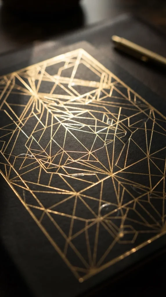
Metallic foil accents can turn an otherwise simple cover into something that feels intentional and polished. Using a foil pen, foil quill, or adhesive foil sheets, add a thin geometric line pattern, a small border, or a single decorative flourish across a matte dark background.
Black, deep navy, or forest green backgrounds make gold or copper foil stand out the most, since the contrast does most of the visual work. Resist the urge to cover the whole surface in foil — a thin line, a small corner accent, or a simple monogram tends to look more considered than an all-over pattern.
This idea works particularly well for anniversary albums, milestone birthday books, or any project meant to feel a bit more formal. It’s also one of the faster ideas on this list once you’re comfortable with a foil pen, since most designs only take a few careful strokes.
If you’re new to foiling, practice your line work on scrap cardstock first, since foil adhesive sets quickly and mistakes are hard to correct once the foil has transferred.
17. Illustrate a Family Tree on the Cover
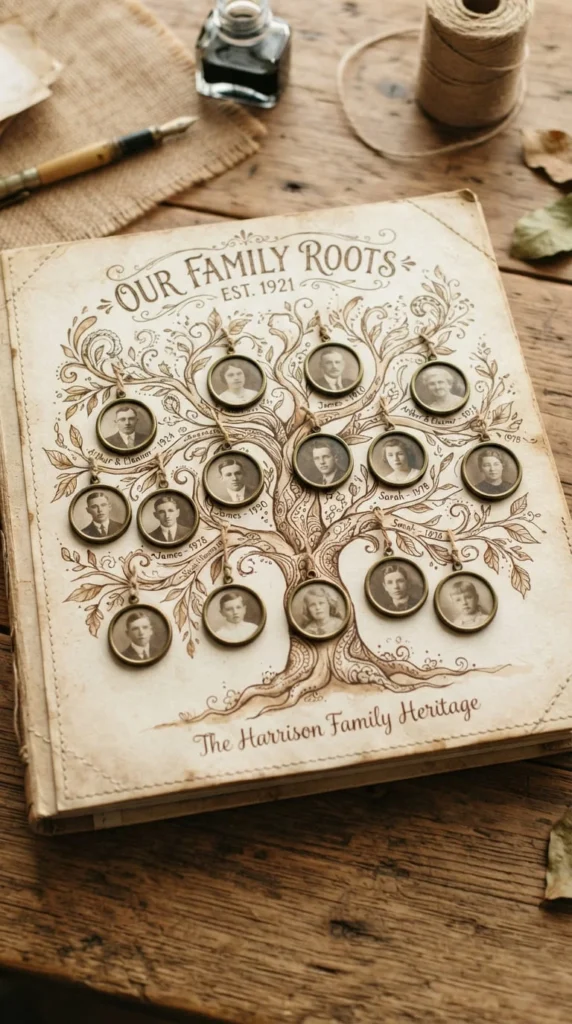
For heritage or multi-generational albums, a family tree cover gives readers an immediate sense of who they’re about to see inside. Sketch a simple tree outline — trunk and a few branching limbs — directly onto your cover base using a fine pen.
Instead of writing names at the end of each branch, attach tiny circular photo cutouts of family members like ornaments hanging from the branches. This turns a static illustration into something genuinely personal and gives visitors a reason to look closely at the cover before opening the book.
Sepia or warm brown tones suit this idea particularly well, since they read as heritage-appropriate without looking dated or overly formal. Leave a little room at the base of the trunk for a family surname or a founding date if the album spans several generations.
This is a more time-intensive cover idea than most on this list, so consider starting with a light pencil sketch of your tree layout before committing to ink, especially if you’re including more than six or seven photo ornaments.
18. Bring the Coast to a Beach Album Cover
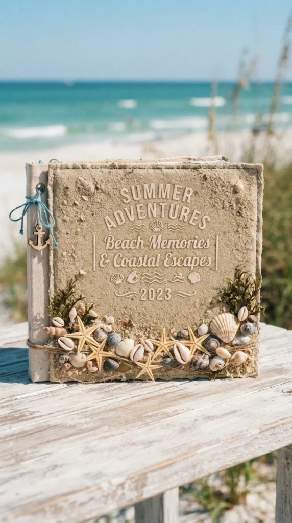
A beach or coastal album benefits from tactile elements that hint at the setting before anyone opens the book. A soft turquoise or sea-glass base color sets the tone, and a scattering of real sand glued along the bottom edge adds genuine texture.
Attach a small real or faux seashell, a bit of dried coral, or a tiny starfish in one corner rather than covering the whole cover in beach elements. A single well-placed detail reads as more deliberate than a busy collection of ocean-themed stickers.
This idea works particularly well with a blue-green color story, which continues to be a strong direction in craft and design palettes overall. Keep any text minimal — a location name and a year is usually enough, written in a relaxed, slightly uneven hand.
If you’re using real sand, seal it under a thin layer of clear adhesive so it doesn’t shed onto other pages over time, especially if the album will be stored upright on a shelf rather than flat.
19. Layer Mixed Media for an Eclectic Look
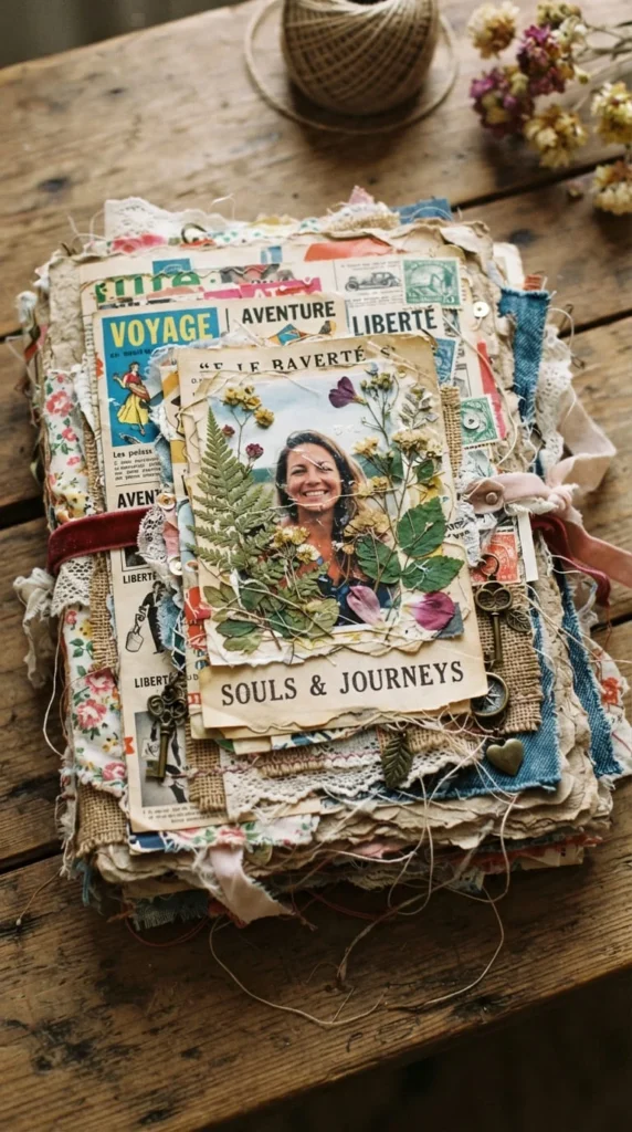
If you have a drawer full of leftover craft supplies — fabric scraps, old magazine clippings, spare buttons, dried flowers — a mixed media cover is a great way to use them all in one place. Layer different materials across the cover, building up texture rather than keeping everything flat.
Start with a base layer of torn paper or fabric, then add smaller elements on top like buttons, ribbon, or pressed botanicals. Vary the height of each layer slightly so the cover has real dimension when you run a hand across it.
This approach suits personality-heavy albums, art journals, or anything where the reader already knows the maker has a distinct creative style. It’s also a genuinely useful way to clear out a craft stash without wasting materials that don’t have a home elsewhere.
Because mixed media covers can get visually busy fast, try to repeat one or two colors throughout the layers so the overall effect feels connected rather than random. A shared color thread keeps a chaotic collection of materials from looking unplanned.
20. Commemorate Graduation With Cap-and-Tassel Details
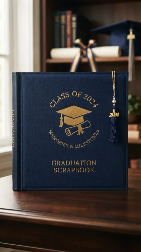
A graduation album cover benefits from a few symbolic details rather than a full collage of school photos. A deep navy or maroon base paired with gold accents immediately reads as formal and achievement-focused.
Add a small die-cut graduation cap silhouette or a real miniature tassel charm in one corner, along with the graduation year in simple lettering. Avoid overcrowding the design — this cover works best when it feels closer to an award than a busy yearbook page.
If the graduate has a school color, work that into your palette instead of defaulting to generic navy and gold, since it makes the album feel specific to that person rather than generic. A small ribbon tie in the school color across the spine is an easy way to add that detail without redesigning the whole cover.
This style also works well as a gift, since it can be assembled before graduation day and handed over already finished, with just a few blank pages left for the graduate to fill in themselves afterward.
21. Keep It Simple With Kraft Paper and Stamps
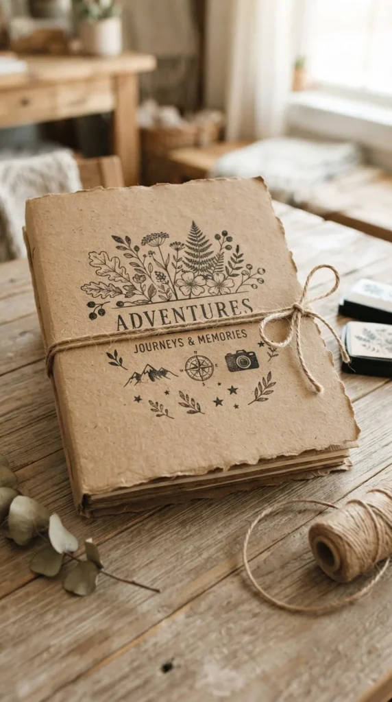
Kraft paper is one of the most forgiving materials to work with because its warm brown tone already looks intentional without much added to it. Use a plain kraft cover as your base, then add a hand-stamped design using rubber stamps and dark ink — a simple flower, a small animal, or a repeating pattern.
Tie the album closed with a loop of natural twine rather than a clasp, which keeps the whole look casual and handmade. This cover style works well for everyday albums — weekend trips, pet photos, casual family gatherings — where a more formal cover would feel out of place.
Because kraft paper is inexpensive and widely available, this is also one of the more budget-friendly ideas on this list if you’re building several albums at once and don’t want to spend heavily on cover materials for each one.
Stamped ink can smudge on kraft paper’s slightly textured surface, so press firmly and lift straight up rather than dragging the stamp, and let each impression dry fully before handling the cover further.
Conclusion
Choosing a scrapbook cover idea really comes down to matching the mood of your photos with a design you can actually finish without burning out halfway through. A minimalist typography cover or a kraft paper design with a few stamps can look just as intentional as a detailed mixed media collage, provided the materials and colors work together. Start with whichever idea on this list uses supplies you already have on hand, test your layout on scrap paper before committing to the final cover, and don’t be afraid to combine two ideas — a fabric base with a hand-lettered title, or a watercolor wash with a small gold foil accent — into something that fits your specific album. Once you land on a direction, the cover often takes far less time to finish than the pages inside it ever did. Pick one idea from this list, gather your materials, and give your album the cover it deserves.